Empire Card commercial - 1970's
Shotlist & Visual Analysis

00:00:00.000 — The still from the 'Empire Card commercial - 1970's' features a simple, solid background with a deep maroon color, typical of the era's aesthetic. The composition seems to focus on minimalism, likely emphasizing the branding or promotional message of the Empire Card from M&T Bank. The image bears the characteristics of a 16mm print, suggesting graininess or texture.
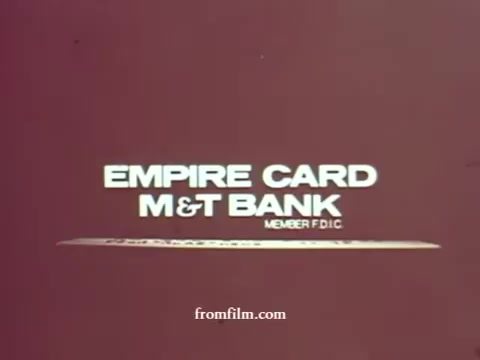
00:00:58.692 — The 16mm still features bold, white text on a simple maroon background, reading 'EMPIRE CARD M&T BANK MEMBER FDIC.' The design is minimalistic, characteristic of 1970s advertising, emphasizing the bank's branding and reliability.
00:00:59.359 — The still features a simple and bold graphic design with the text 'EMPIRE CARD' prominently displayed above 'M&T BANK,' emphasizing the bank's branding. The background is a muted shade, contributing to a retro 1970s aesthetic. It also includes 'MEMBER FDIC' to highlight the bank's affiliation and credibility. The overall composition is straightforward and focused on promoting the Empire Card service.